5.15. Statistics Charting
This section describes the Statistics Charting panel which can be used to view a real-time chart of various statistics counter values from selected streams.
The section describes the new version of the charting panel introduced in XenaManager version 1.43. The original simpler charting panel is no longer supported.
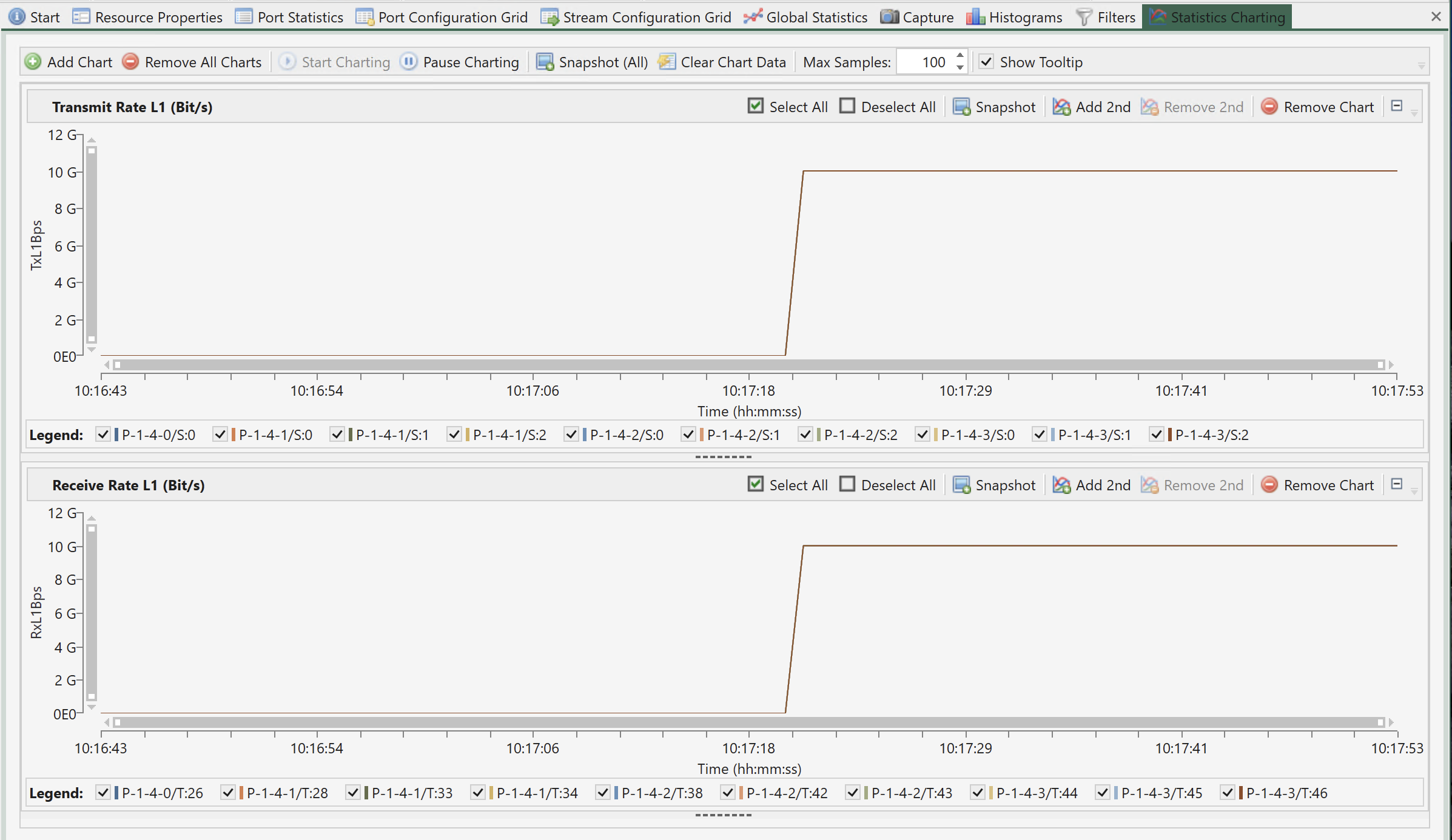
Fig. 5.139 Statistics Charting
5.15.1. Overview
Charted Parameters
The charting panel allow you to view real-time charts of a number of monitored parameters. You can define multiple charts within the chart panel which can each display separate parameters. Each panel can optionally display two different parameters where each parameter then is associated with its own Y-axis (left or right).
Selecting Data Sources
The charting panel will always be associated with the ports and streams in the current testbed. It is possible to select exactly which streams are used by each individual panel.
Counter Types
It is possible to chart all the counter types available in the statistics panels.
Port Polling Aspects
When charting receive-side counters it is important to ensure that the port(s) you expect the packets to arrive on are polled for counters.
To decrease the performance impact of too much polling the XenaManager will by default only poll ports that are visible in a panel that requires the polled information. This primary includes the various statistics panels. So if you are currently not viewing e.g. the statistics panel for a given port the port may not be polled.
When you add a stream to the charting function the XenaManager knows which port this stream is defined on and will ensure that any such port is polled. This ensures that any transmit-side counters will always be polled. But the XenaManager cannot know which port(s) the packets sent by the streams actually arrive on. You need to help the XenaManager by either ensuring that you are viewing the statistics panel for the receiving port or by enabling the the Poll Always property in the Port Receive Statistics toolbar in the Port Statistics panel.
5.15.2. Charting Details
Note
Chimera module and its ports for network impairment measurement also offer support for statistics charting functionalities.
This section explains how to configure and use the charting function.
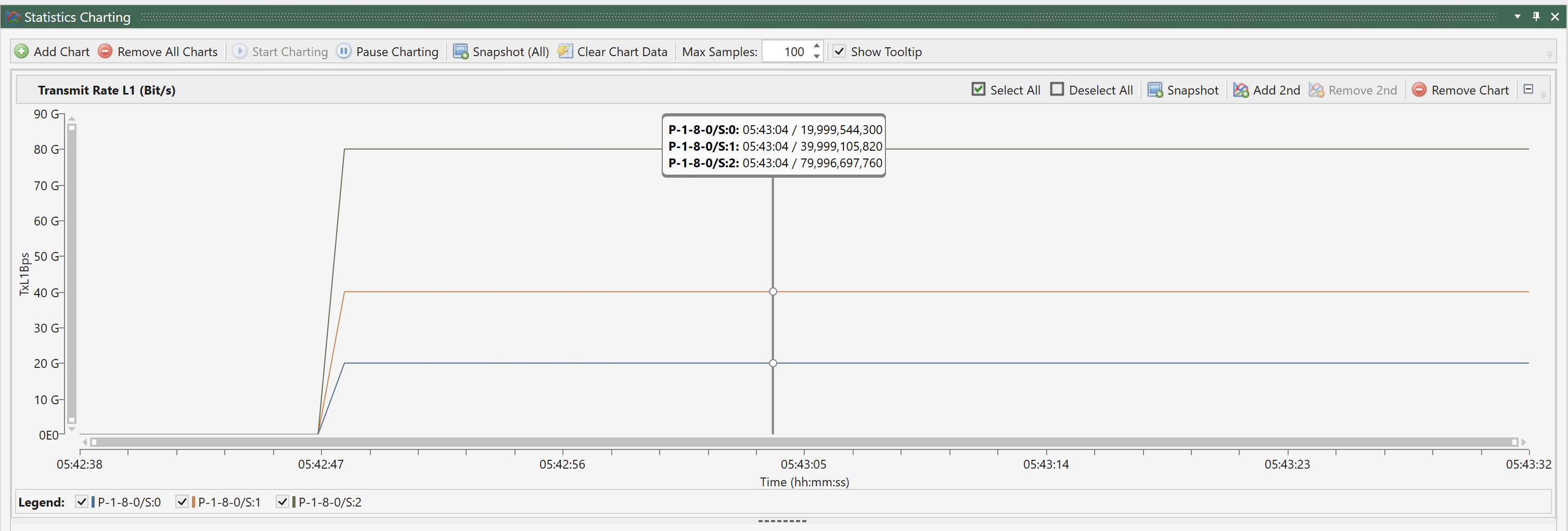
Fig. 5.140 Charting details
5.15.3. Chart Control
Add and Remove Charts
You can add any number of charts to the chart panel. The defined charts will be stacked vertically on top of each other. To add a new chart simply click the Add Chart button in the top toolbar. You can now select the parameter type which you want to be charted from a dialog.
To remove a chart simply click the Remove Chart button in the chart toolbar. If you want to remove all charts you can also click the Remove All Charts button in the top toolbar.
Start and Pause Charting
When you have added the chart(s) you want to use you need to start the charting function by clicking the Start Charting button in the toolbar. To pause the charting function you can click the Pause Charting button. You can re-start the chart by clicking the Start Charting button again.
The data will continue to be collected in the background so the chart will be fully updated with the collected data once you resume charting.
Add a Second Parameter
When you add a chart the selected chart parameter will by default be associated with the left Y-axis. It is possible to add a second parameter to a chart by clicking the Add 2nd button in the chart toolbar. The second parameter will be associated with the right Y-axis.
Selecting Stream Sources
By default all streams in your current testbed will be part of the charts. The streams are shown in the legend below each chart.
You can select which streams are part of a chart by checking or unchecking the checkbox in front of each stream in the legend. You can also control the state for all streams by using the Select All and Deselect All buttons in the panel toolbar.
5.15.4. Visual Aspects
Controlling Chart Size and Visibility
The size of each chart can be controlled by holding and dragging the dotted handle at the bottom of each sub-chart. It is also possible to control the visibility of a chart completely by clicking the little plus/minus icon in the right side of the chart header.
Chart Sample Span
The number of samples in the chart is determined by the Max Samples property in the panel toolbar. Once the total number of samples in the chart has reached this number older samples will be dropped from the chart when new samples are added.
Controlling Tooltip
By default a rather large tooltip with information about the plot points under the mouse will be shown when you hover the mouse over the chart. You can disable this function in the panel toolbar.
Zoom and Pan
You can use the chart scrollbars to zoom and pan the results as described on this page.
Taking Snapshots
You can grab a snapshot of the charts by using one of the Snapshot buttons. This action will generate an image and copy that to the Windows clipboard. You can then paste it into your favorite reporting tool, such as Word or Excel.